
What is contrast?
This week Games-Workshop has announced an expansion of their most popular paint range they have ever released, which has been copied by Army Painter with Speed Paints, Scale 75 with Instant Colour and many others out there.

So, what is contrast?
Whenever I ask this question, I like to first go to a definition, as a base.
noun
/ˈkɒntrɑːst/
the state of being strikingly different from something else in juxtaposition or close association.
"the day began cold and blustery, in contrast to almost two weeks of uninterrupted sunshine"
Contrast in short, is the level of difference between things. White against black, is the strongest contrast you can have, but colour (shade in the most technical sense) isn’t the only type of contrast you can have but it is what people are generally referring to.

This is what most people are saying when they refer to contrast and what those contrast paints are trying to imitate. It is trying to create strong contrast between a single colour or shade (shades are black and white along with greys) and make something more saturated than something else. Okay what is saturation?! This is the problem with doing miniature painting it starts getting into ‘real’ painting and some of the terms they use. So here we go down the rabbit hole.

Saturation is quickly defined as
noun
modifier noun: saturation
(especially in photography) the intensity of a colour, expressed as the degree to which it differs from white.
There are quite a few other definitions for Saturation but this is the most quick and dirty one from the dictionary but for us this is what it means.
Saturation refers to the intensity of a colour. (make bigger)
Saturation means colour intensity basically redder reds and bluer blues. However, that isn’t that helpful. So instead, here I am going to refer back the worst named paints in the whole world. The Citadel Paint range.
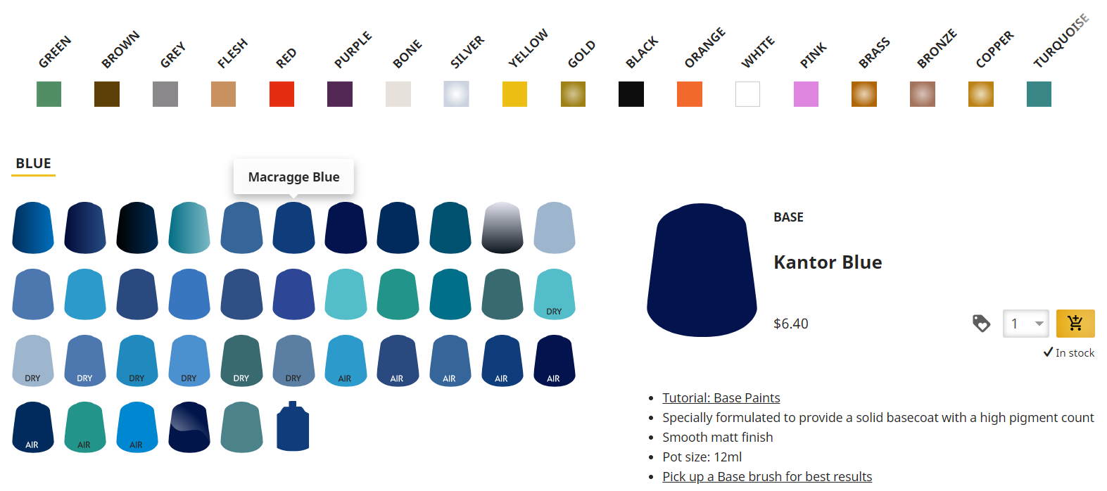
Kantor Blue is much darker than Macragge Blue. This makes Macragge Blue more saturated but not because there is more white in the paint but just because there is less black. Macragge Blue is the most saturated paint if you were using that and Lothern Blue because Lothern Blue has more white in it. That is how saturation works, at its peak it is the bluest along that line that it can be. In terms of Games-Workshop/Citadel colours Macragge Blue or perhaps Caledor Sky is the most saturated pure blue they have because many of their other blues are aquas but still there, there are the highest saturation point colours such as Temple Guard Blue being the highest saturation between Thousand Sons Blue and Baharroth Blue. By the way what colour is Young Kraken Green?
In terms of miniature painting these are known as base, layer and highlight, but in the artworld these have different names, those names are shadow, mid-tone and highlight. Effectively for miniature painting these are exactly the same terms if you hear someone say one of these things, they are interchangeable if used in this manner. Layering and layers are different however.

This is a high contrast miniature but not particularly due to saturation levels which are much closer together than say the White Lion miniature above… But why? Because
“the state of being strikingly different from something else in juxtaposition or close association.”
If you look at a colour wheel you will see that green and orange are opposites, you don’t need to look at a colour wheel to know black and white are. So not just the gem, but also the base contrasts with orange on the miniature. This is what people are talking about when they say sometimes say ‘You need more contrast.’ Which can be annoying because you thought they were talking about the saturation levels above. This is also known as colour theory and having strong contrasting colours.

This here shows contrast of kind. The shoulder pads contrast well against the rest of the model because of how glossy they are, they are vibrantly glossy whereas other things are matte. The contrast between the molten weapons and the beards is due to the contrast being the subtle glossiness and the smoothness of the beards despite using similar colours. The chaotic randomness of the blade.
This can be helpful when working on models where it is difficult to get colour contrast in, such as this death guard model.

Having the slimy tongue against the corroded metal gives a high value contrast even if you were to use the same colours. You also have the mechanical against the organic and so on. This is what I would call, contrast of kind in miniature painting.
Conclusion
These are the three different types of contrast most people talk about in miniature painting. If you want people to notice your model the second type of contrast is the most important, ‘Colour contrast’. If you want to win competitions the first one is the most important, having strong contrast between single colours or different saturation levels. If you have chosen a colour scheme foolishly and you have ‘painted yourself into a corner’ then, contrast of kind is what you’re looking for.
Until next time friends…
Keep those brushes wet